Ready.app
A Canvas for your time.
I designed Ready.app independently — driving all product thinking, UX, UI, and prototyping. While the execution was solo, the process was collaborative — shaped through dozens of conversations with managers, founders, and ICs. Each surfaced a common theme: the calendar was central to their day, yet disconnected from the tools they relied on to make meetings productive.
Where it began
This project began not with ambition, but with a quiet realization.
It started as a tool to help managers run more intentional 1:1s.
But again and again, the conversations pointed to something larger —
not just the meetings themselves, but the disjointed experience around them.
“I live in my calendar, but it offers very little in return.”
“I take notes in one tool, set follow-ups in another, and lose both by tomorrow.”
“Every meeting begins with switching tabs and catching up.”
The conversations weren’t about features.
They were about fragmentation.
About the cost of switching between tools.
About how easily decisions and follow-ups slip through the cracks.
And how little the calendar — the one tool always open — brings together.

A constellation of thoughtful tools.
Granola (insight), Things (structure), Notion Calendar (context).
Each beautifully designed.
Each solving one part of the problem with care and clarity.
But each existing in isolation.
These tools didn’t just inspire Ready.app — they revealed what was missing.
Together, they formed a system I depended on. But one I had to manually maintain — copying between tools, losing context, and stitching together a flow that never truly fit.
The goal was to design something unified from the start: a single system where notes, tasks, and time exist together — fully connected, and purposefully designed.

The sidepanel became the place to bring everything together — tasks, time, structure, and memory — in one continuous view.
Each element is familiar — a list, a block of time, a priority for the day. But the way they live together — in one unified, persistent panel — made the experience feel whole. The goal wasn’t to invent something completely new, but to arrange what was already essential in a way that felt obvious — as if this is how it always should have been.
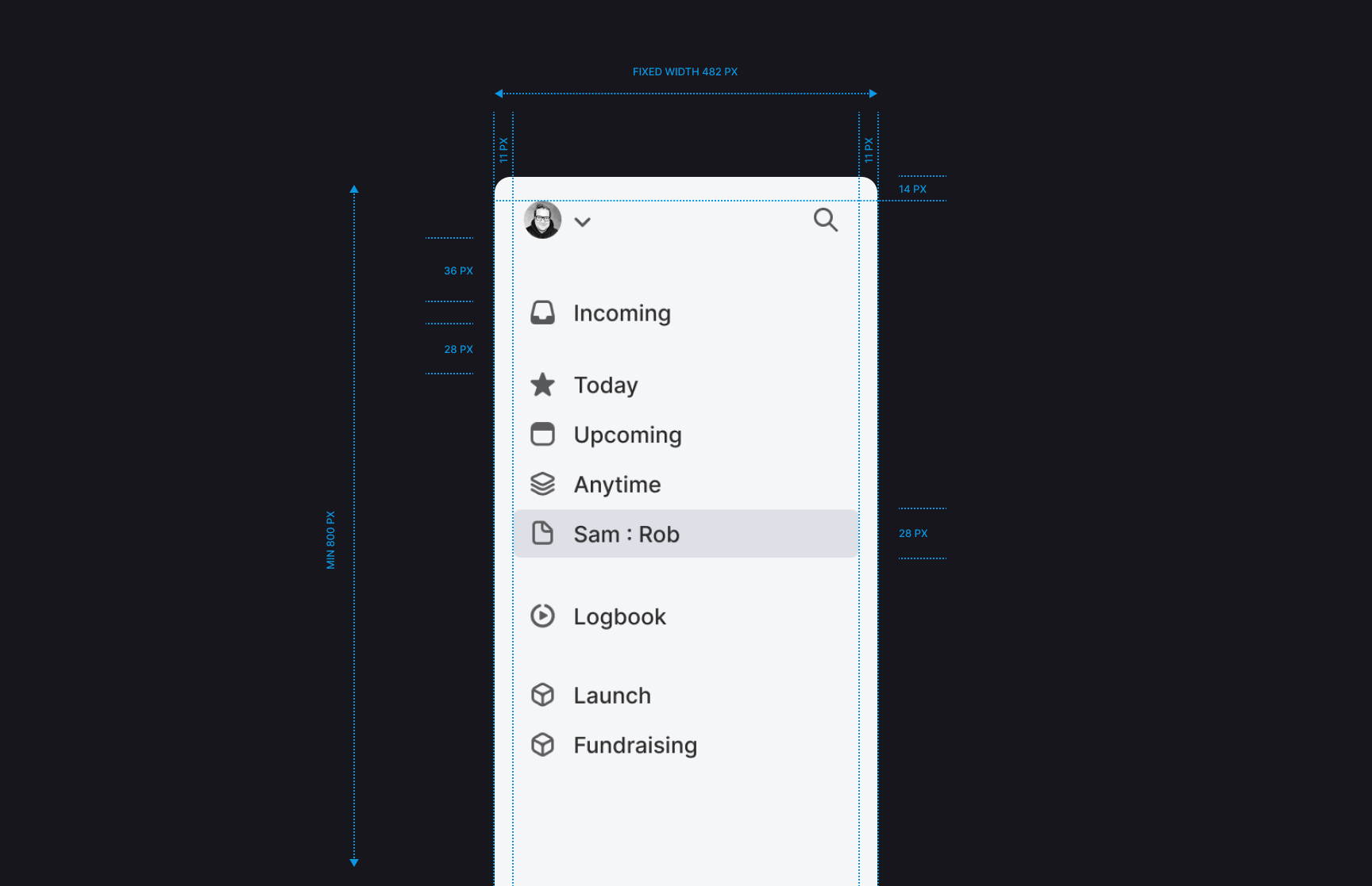

The sidepanel was designed to behave more like an assistant than an interface — always nearby, but never in the way. It responds to context with quiet flexibility, not through complexity, but through balance in spacing, weight, and rhythm.
One view. Everything that matters.
The layout reflects how you naturally think — not in apps or tabs, but in flow.
On the left, choose focus.
In the middle, active work.
On the right, time: not just a schedule, but a system of intent.
Each section speaks to the others, without visual hierarchy — because attention moves fluidly. The goal was not to add, but to remove — until only what was meaningful remained.

The task checkmark needed to be unique. It’s the most emotional moment in any productivity app — so it had to feel earned, not gamified. It completes with a gesture that feels intentional. No bounce. No badge. Just a clean transition to clarity.

Why tasks live at the center.
Some tasks are clear and scheduled. Others are flexible — still forming, still uncertain. Placing tasks in the center made space for both. Here, drag-and-drop becomes more than an interaction — it becomes a way of thinking: not just moving tasks, but shaping how they fit into the flow of a day.
To the right, into the calendar — if the user knows when to do it.
To the left, into the sidepanel — if it’s meant for today, for anytime, or for Upcoming, where the system can suggest time automatically.
It’s a small structural decision. But it changed how the product felt: less like a series of tools, and more like a system that supports decisions as they happen.
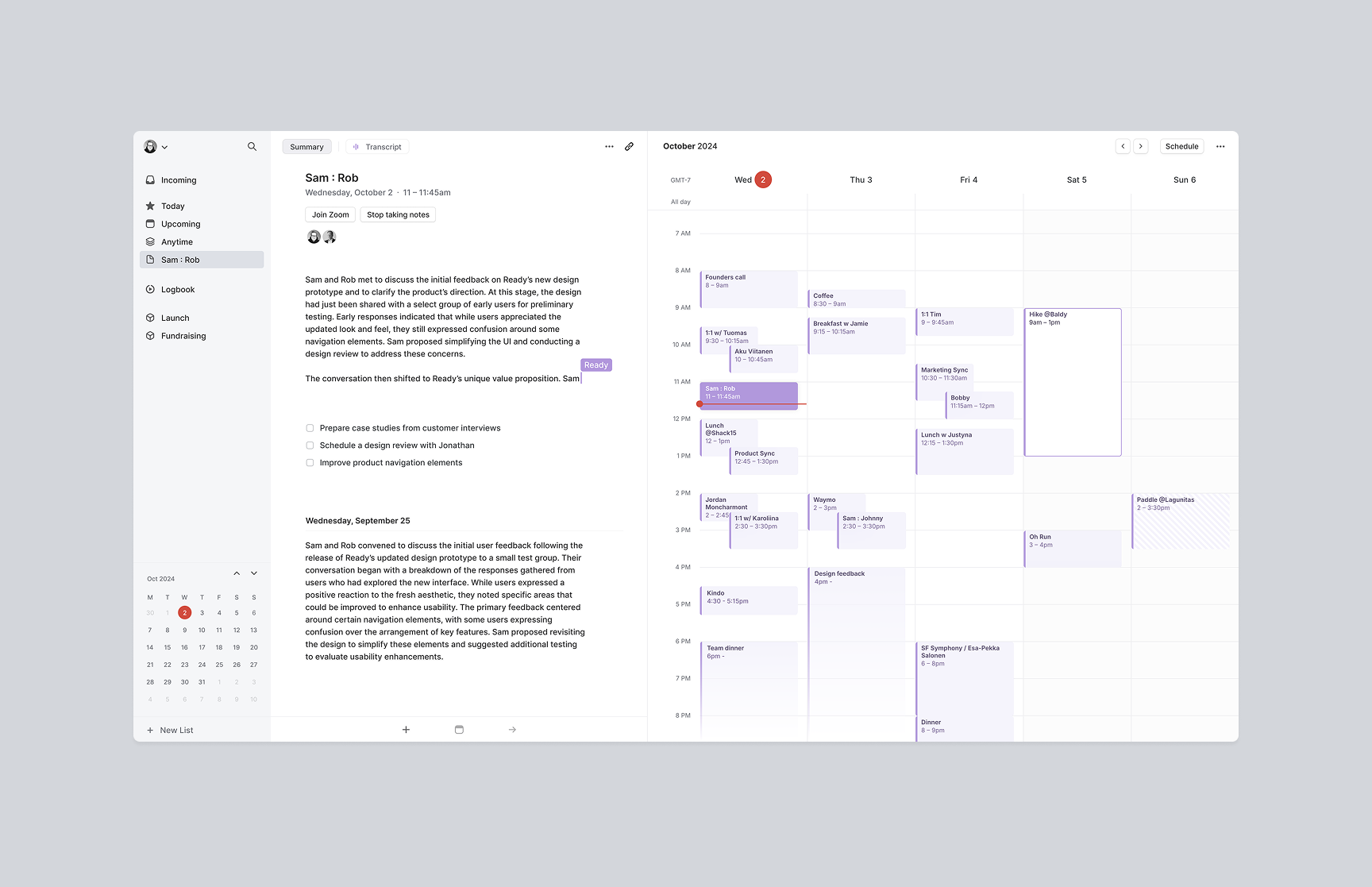
Notes, placed with context and intention.
Notes carry weight — not just as text, but as context, as the starting point for action.
Placing them in the center was a way to give them the space they deserve. Here, they sit alongside tasks and time — because that’s where their meaning lives.
Each calendar event opens directly into this space, removing the distance between what happened and what needs to follow.
The goal was not to design a better notes feature. It was to treat each note as a connected moment — anchored to your calendar, linked to people, decisions, and the time that shaped them.